Brand Photography - Why It Matters
Every business needs an identity - something your customer can see and feel before they even speak, set foot in, or visit your business online.
Over the past four years I have been building and evolving the look of Urban Float. As the primary Marketing person behind the brand and its designer/photographer, it is my job to communicate the brand to our customers.
For those that don’t know - Urban Float is a national leader in Floatation Wellness Therapy. What is Floatation Therapy? In a nutshell, it’s weightless relaxation also commonly known as sensory deprivation. Float pods and/or tanks are filled with ultra-purified water with over 1200lbs of medical grade epsom salt and heated with the ability to eliminate sound and sight. This solution / experience creates an anti-gravity sensation that can only be mimicked in two places, Space and the Dead Sea.
When I started four years ago - our content was slim and had no real identity to itself. Most float centers, Urban Float included relied upon heavy contrast photos that didn’t really deliver the correct message.
Original Assets
Photo Credit: Urban Float // Original work by Thor Radford - 2013
As you can see from the above and below photos - you see what appears to be dark, heavy contrast silhouette style photography. You vaguely can see the Float Pod or the room. This imagery, at the time was still ahead of the game - but it could be better!
I re-edited the original photo to give more life and balance and to make the service feel less claustrophobic.
This is not what the customer will see.
But it looks fantastic doesn’t it? She obviously looks like she’s “floating” but in what? where? how? These types of photos work well when you’re delivering a mainstream service like… Yoga or Crossfit - but not Floatation Therapy.
When I joined the Urban Float team - it was my job to transform this heavy contrast look into something more relatable to regular consumers. This as you know doesn’t happen overnight! The photo above highlights new perspective and how calm and relaxing floating is. Urban Float prides itself on delivering a seamless experience in some of the best built rooms of any Float Center in the world. Previously the consumer wouldn’t know this - so we showed them. However there was a shift in the brand identity (not my decision) to give our look a heavy white spa feel. While we nailed this in execution - we still lost sight of what matters.
It was time for a change.
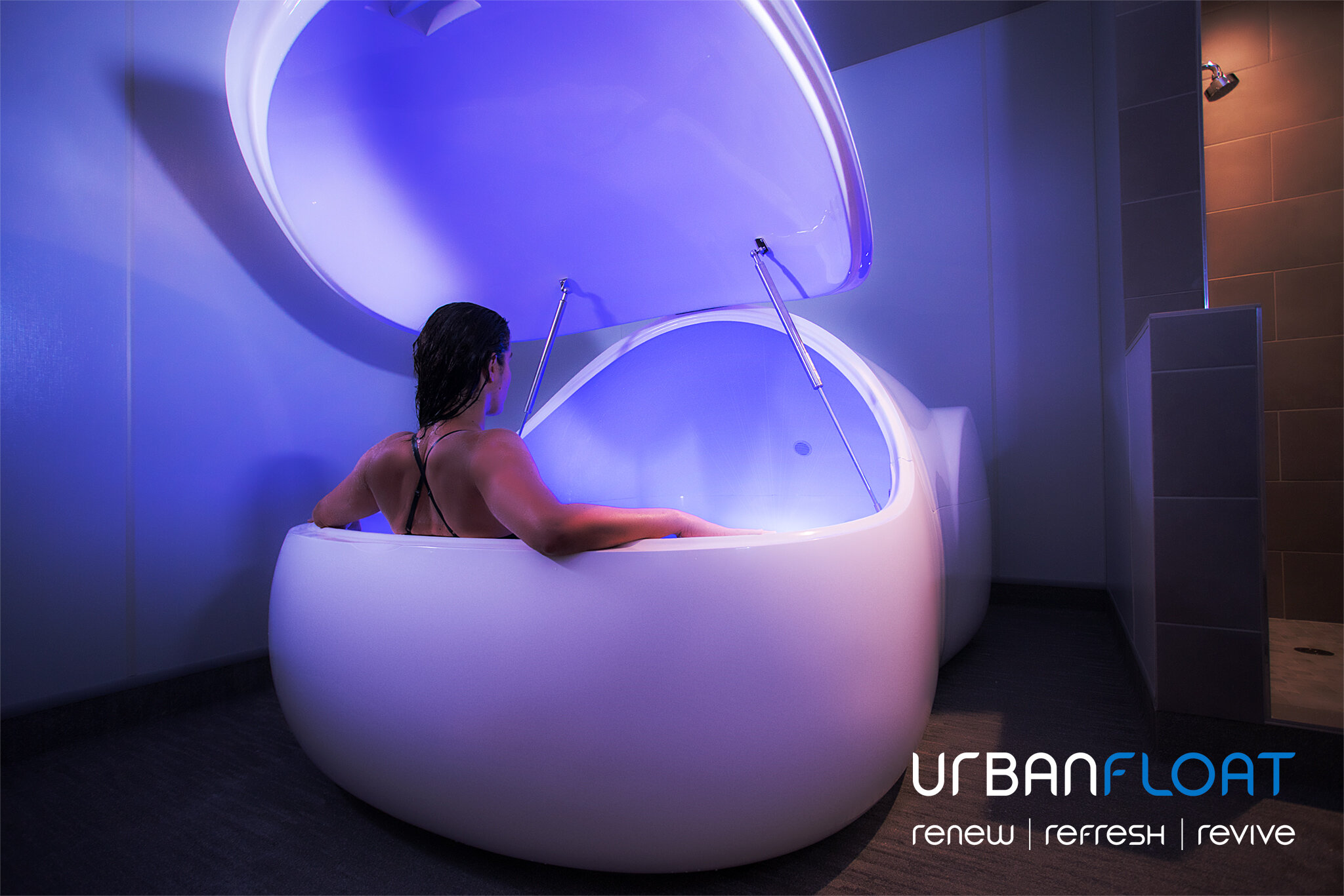
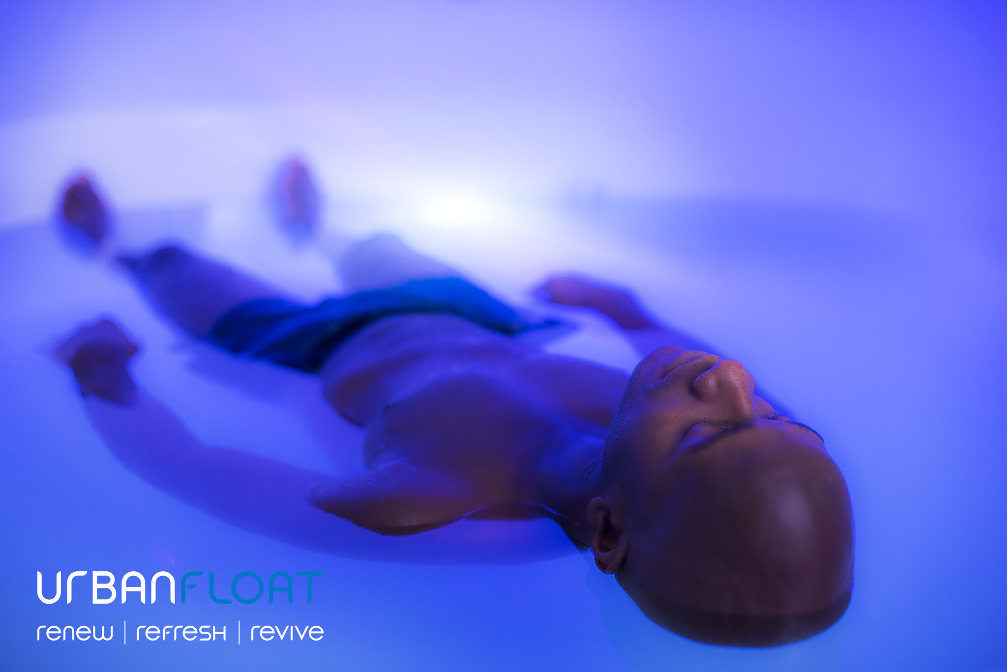
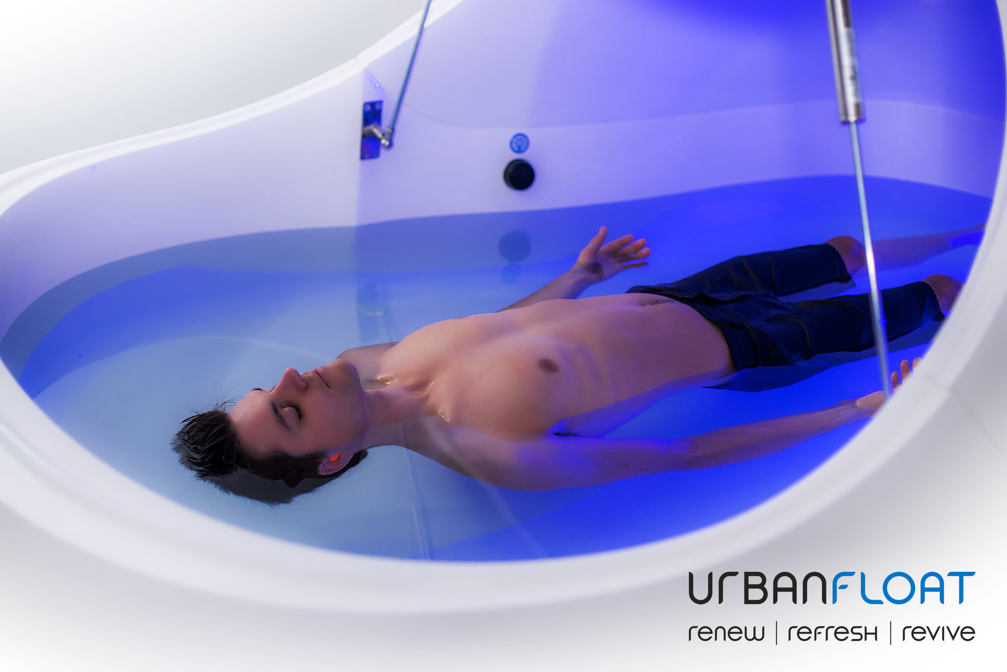
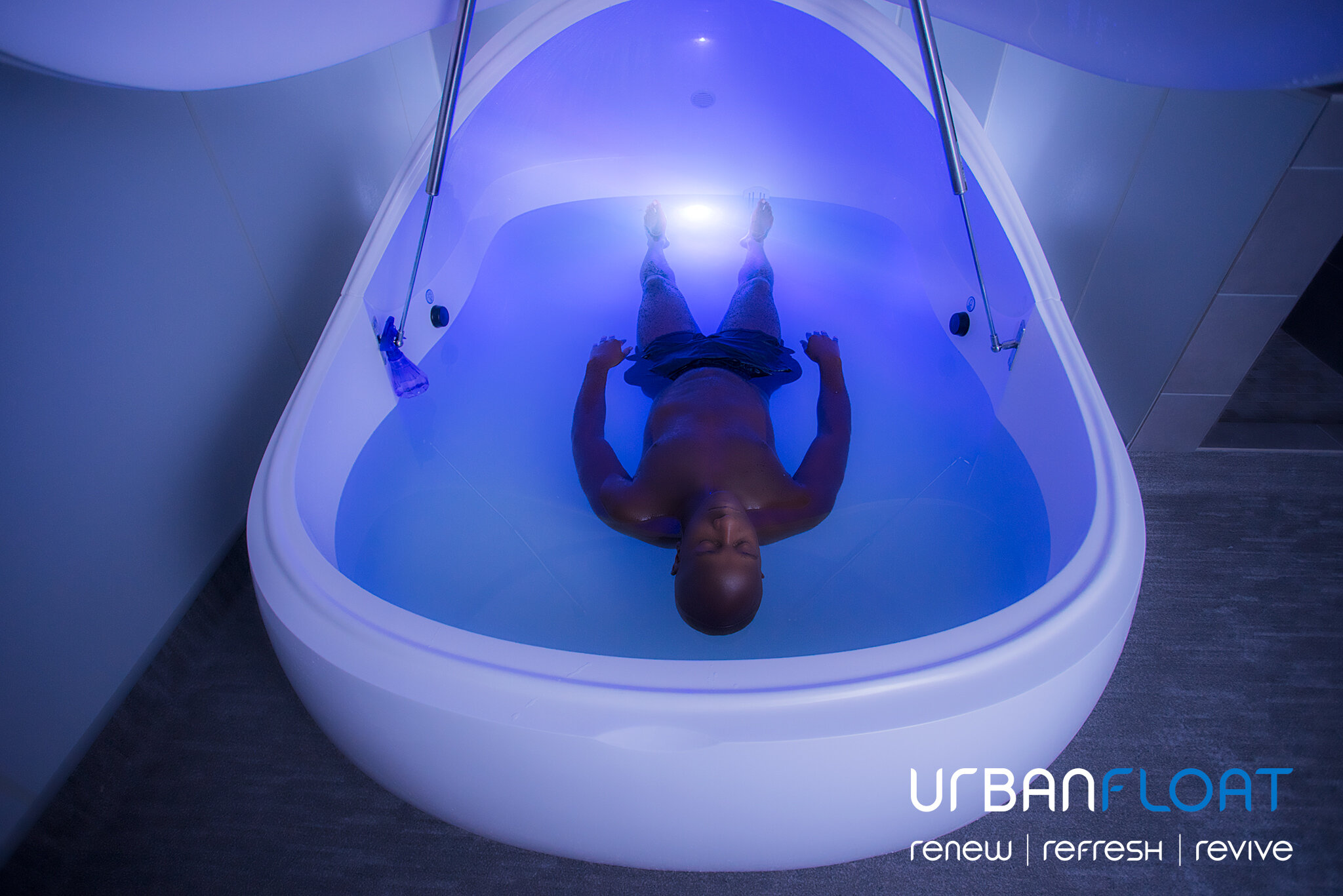
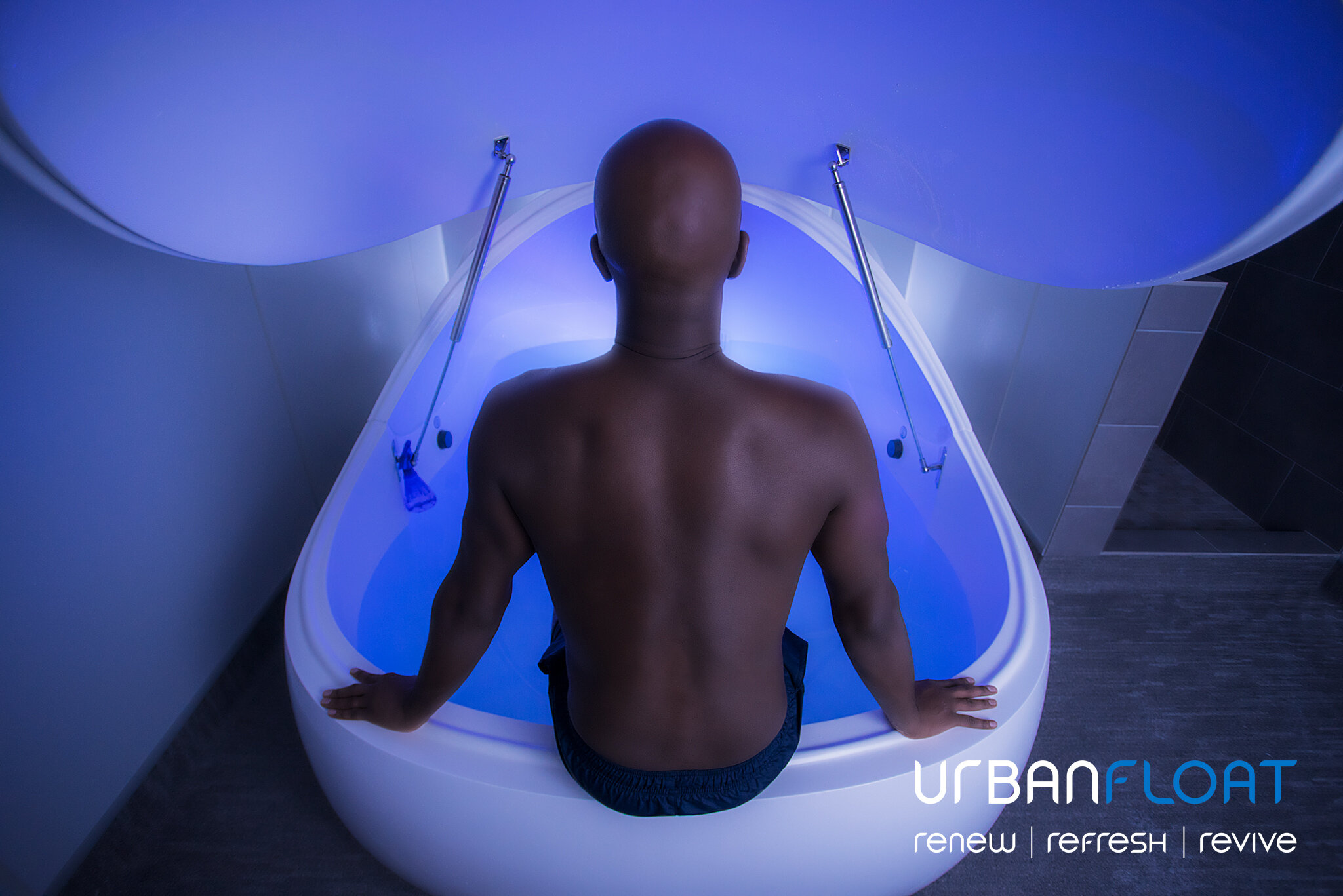
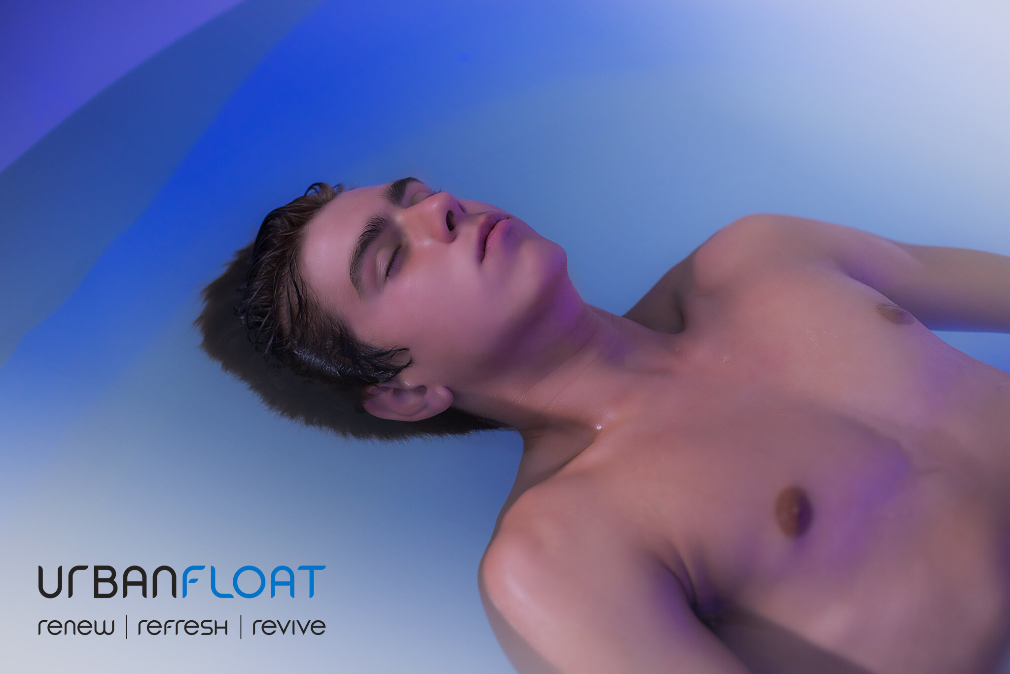
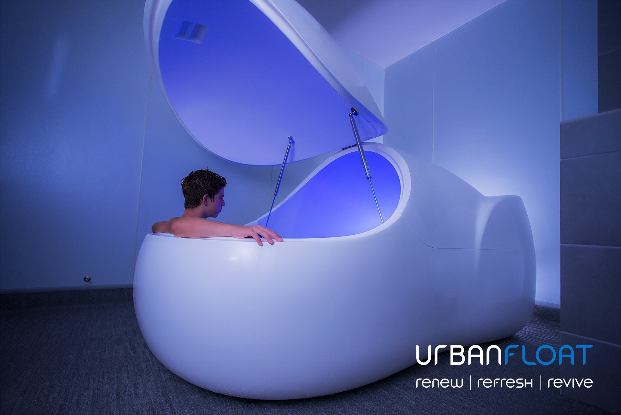
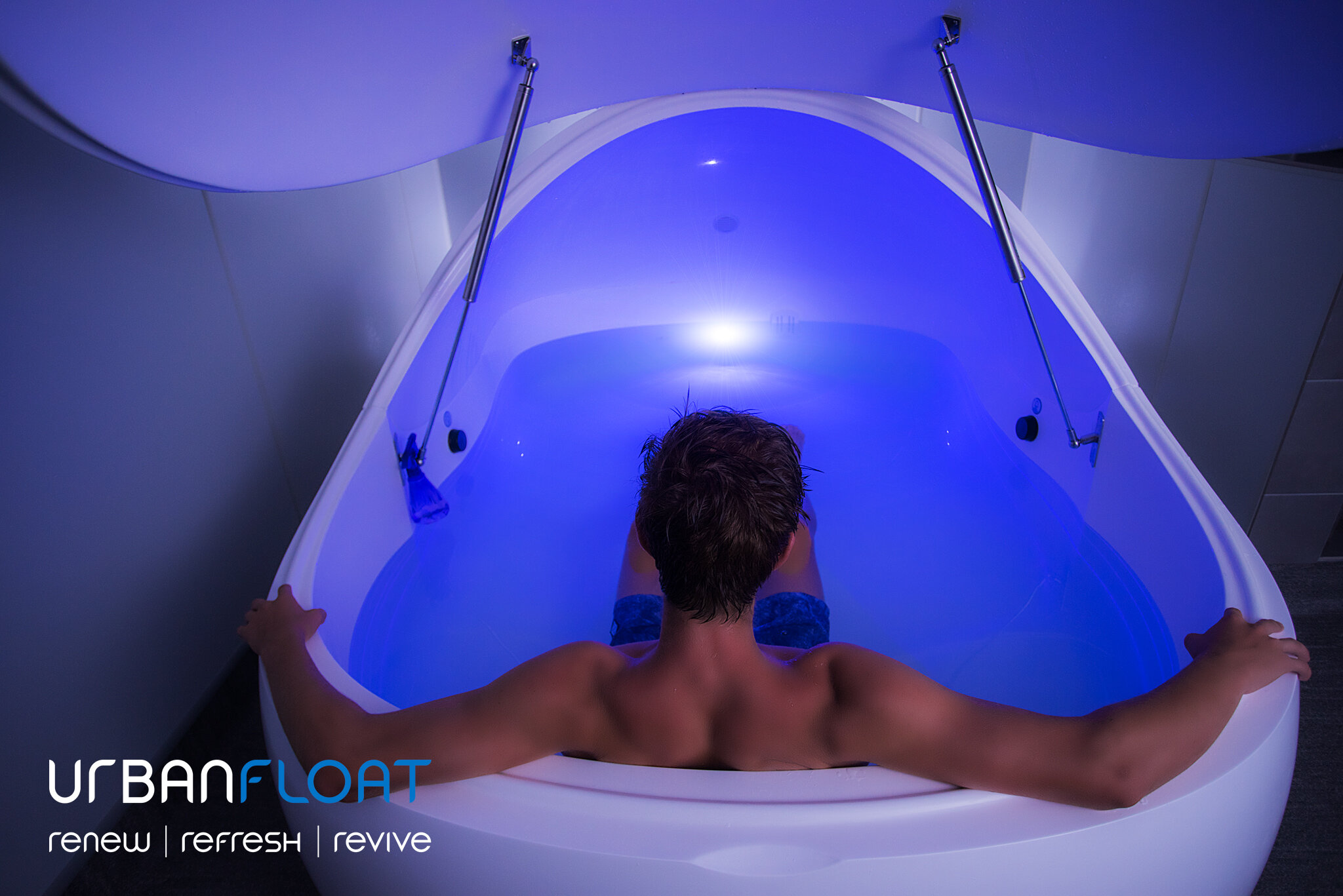
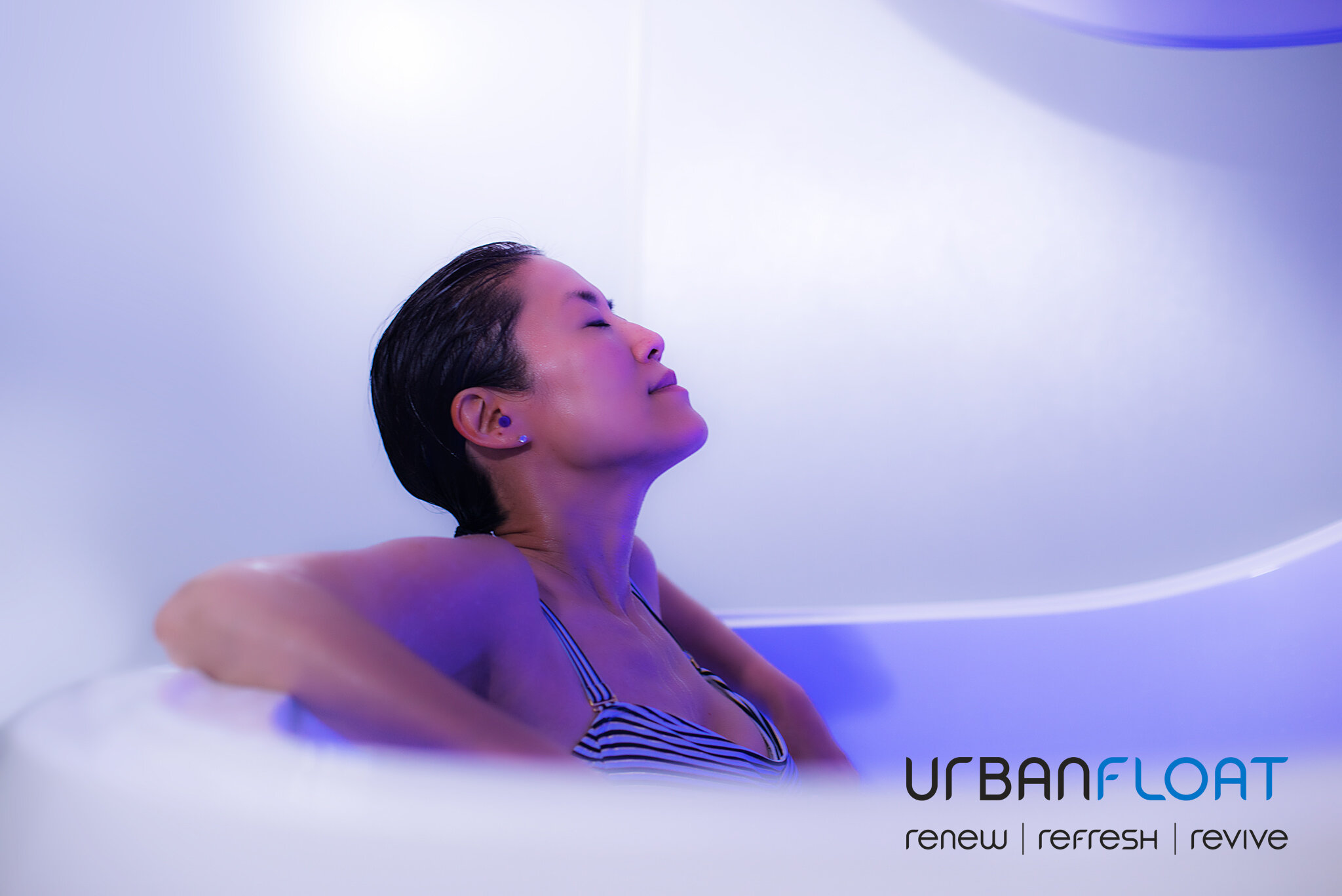
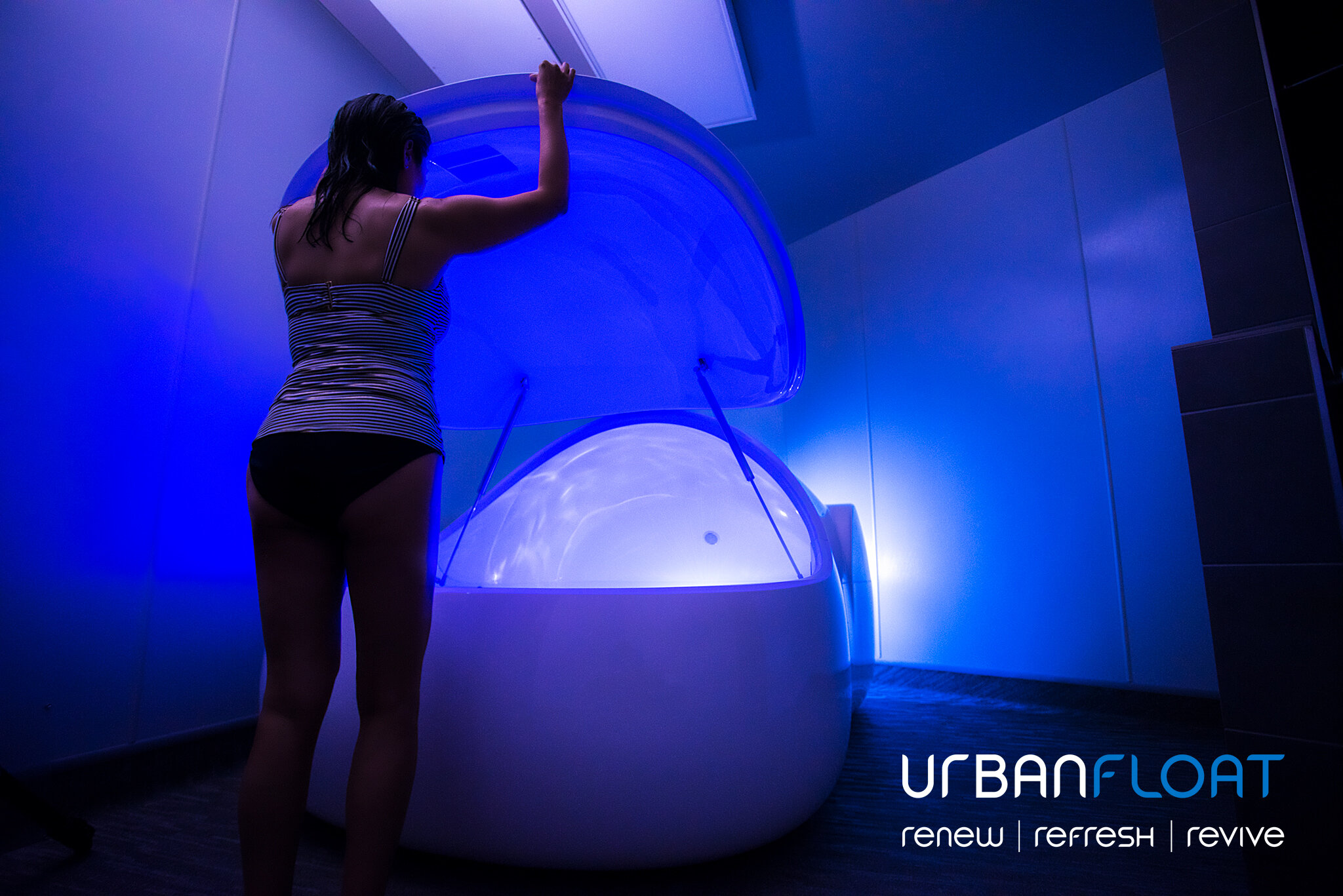
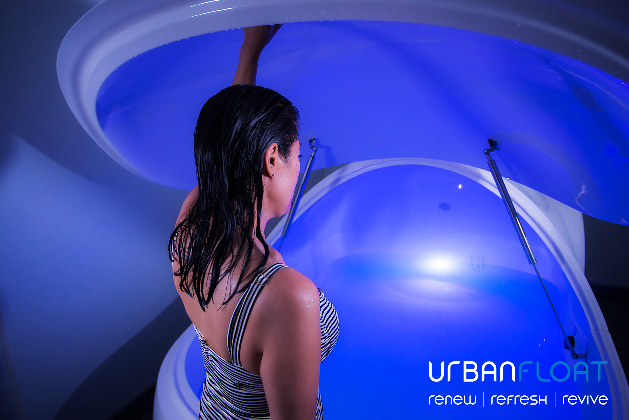
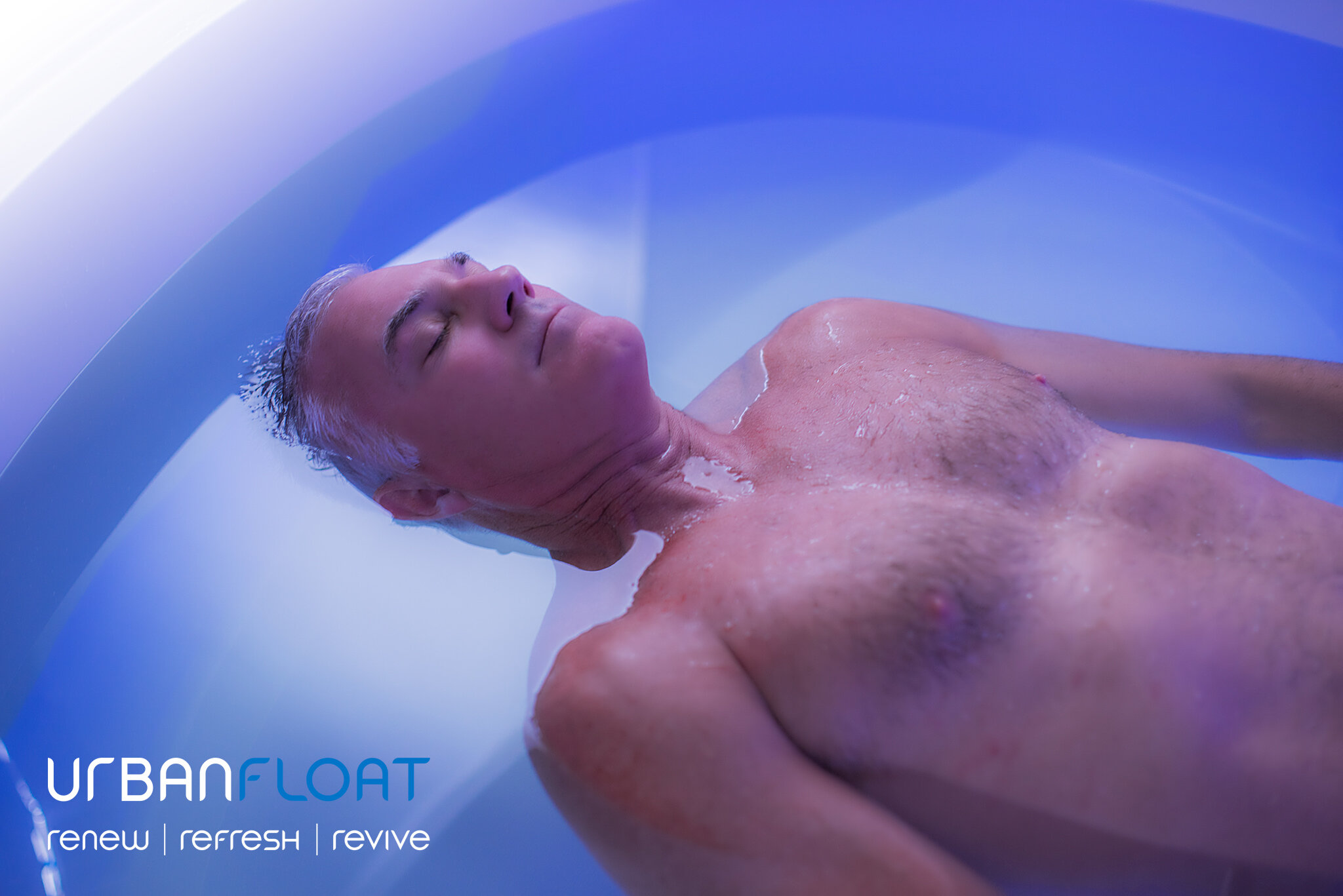
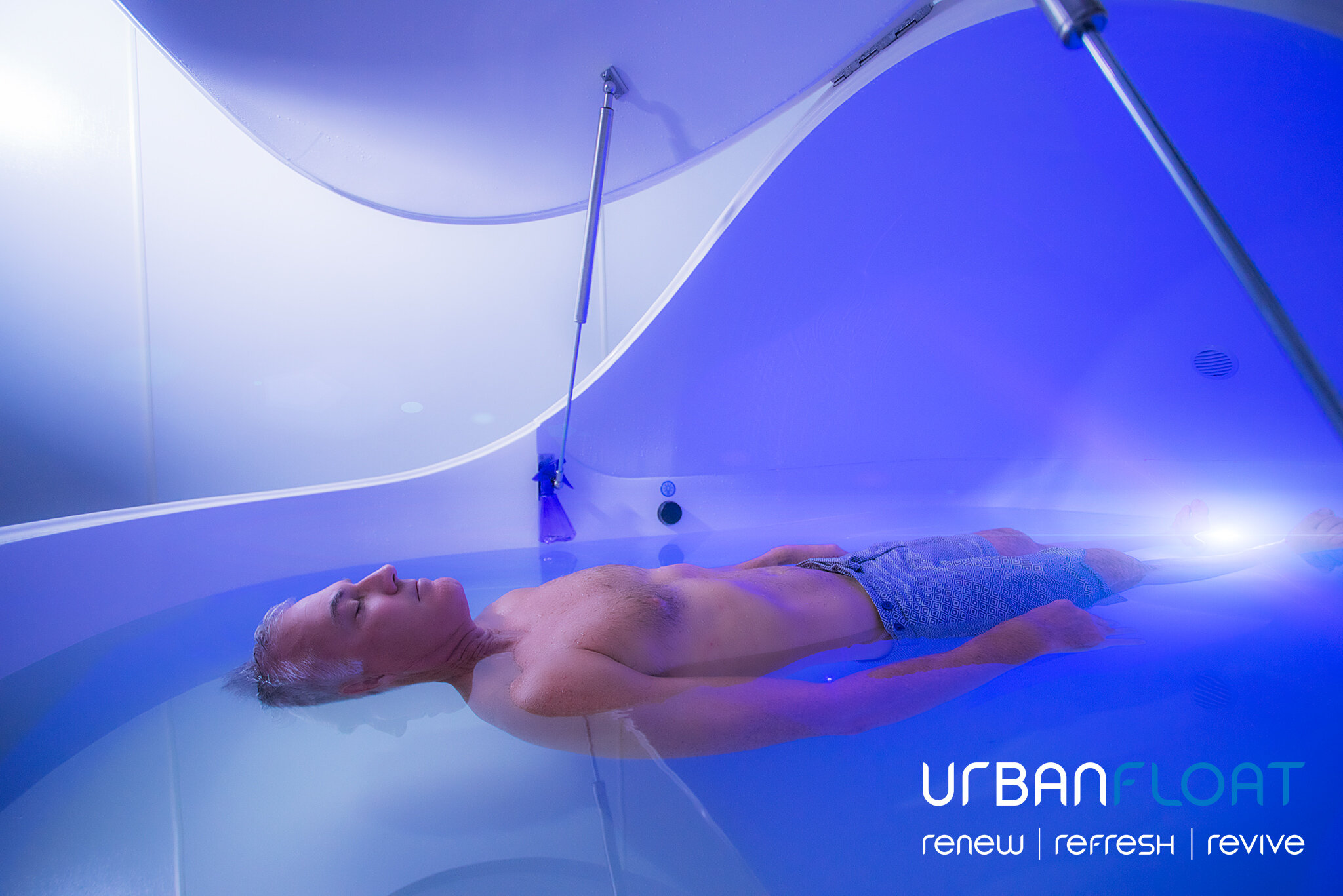
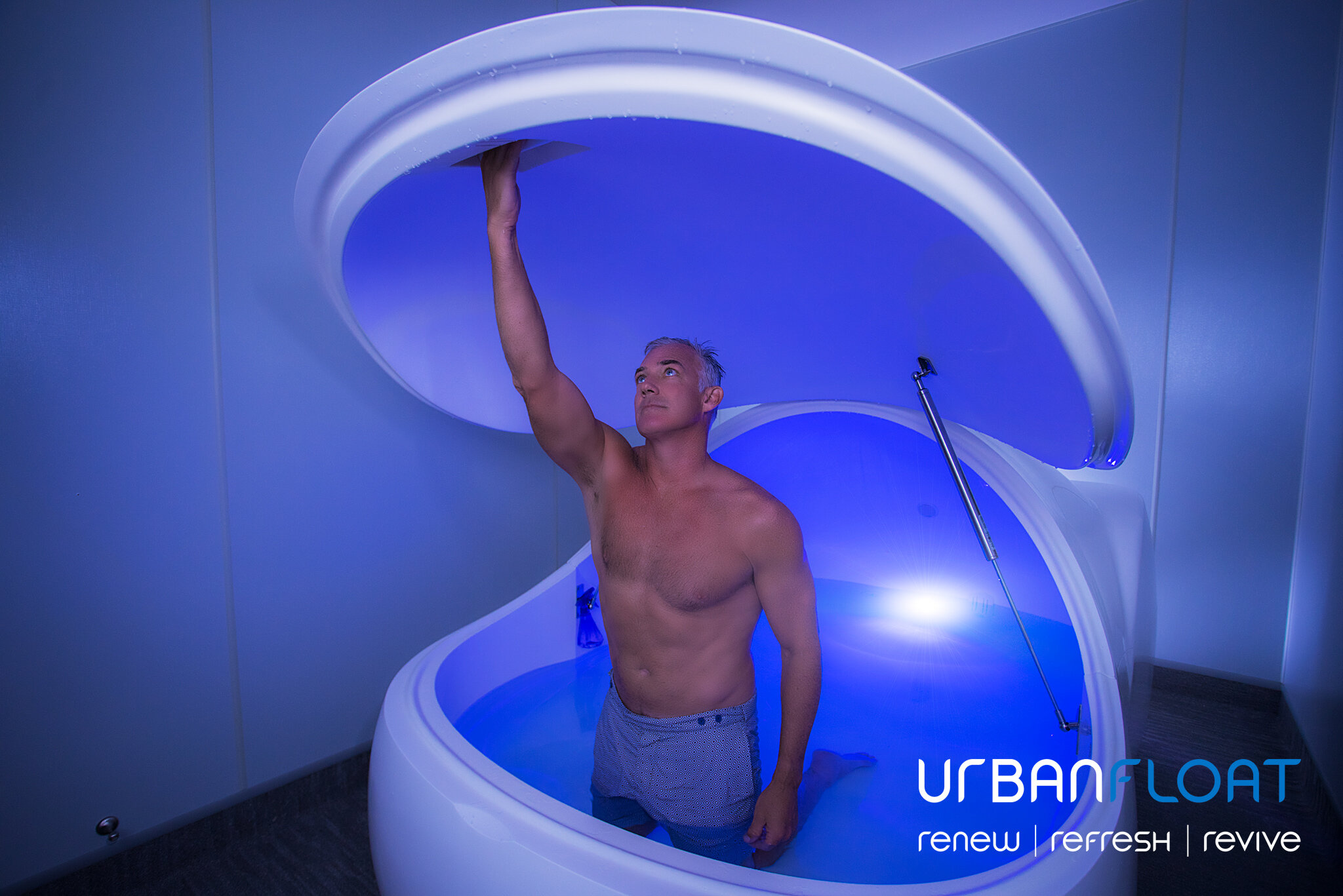
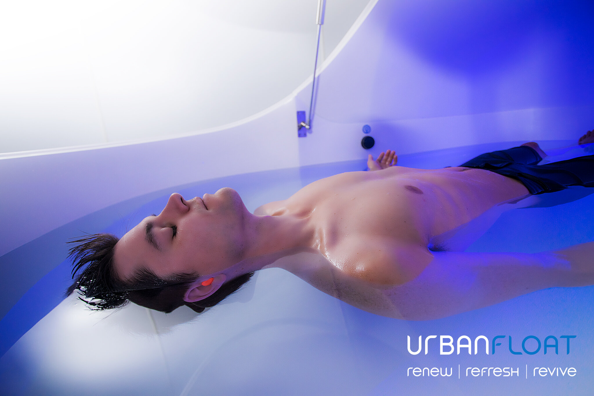
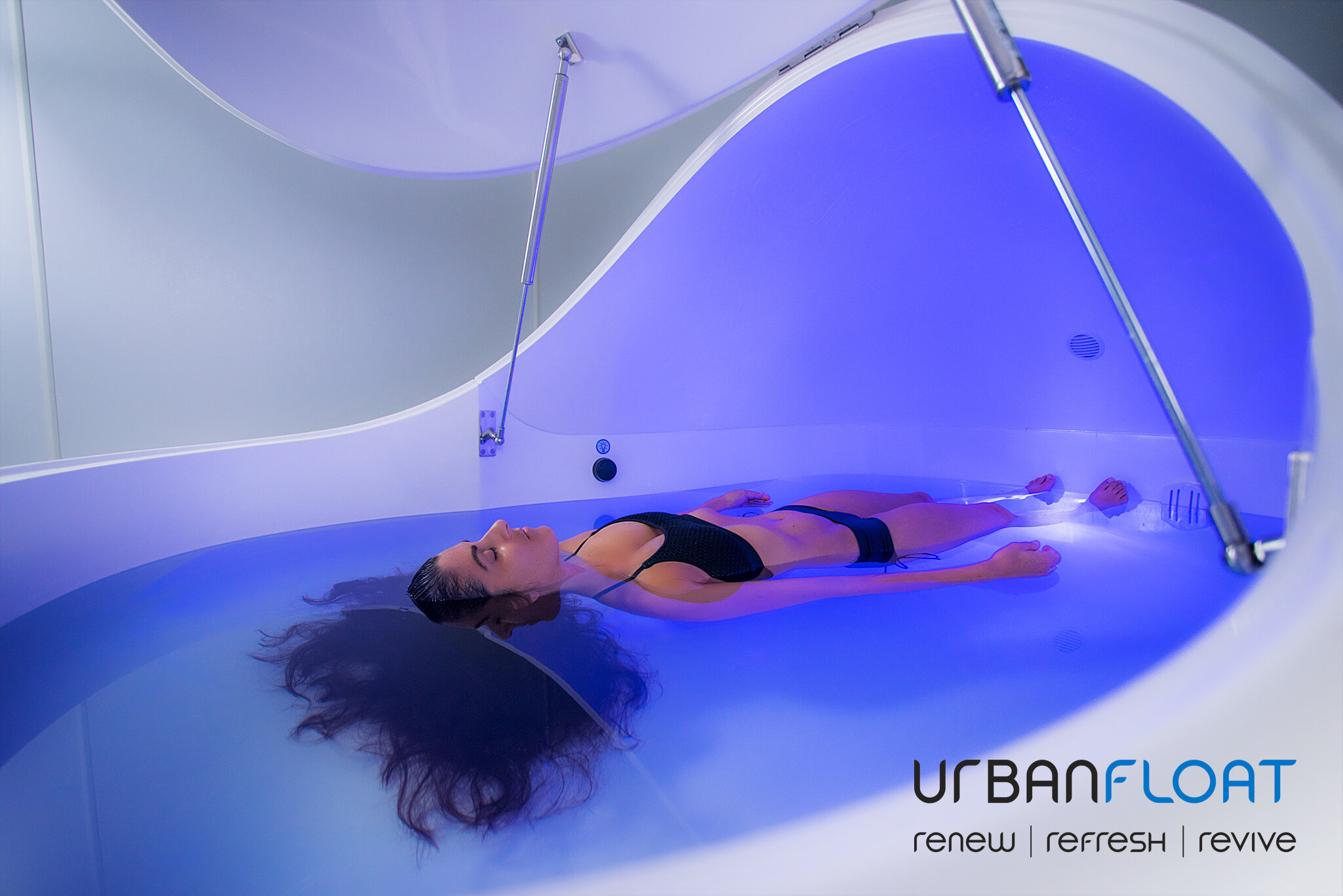
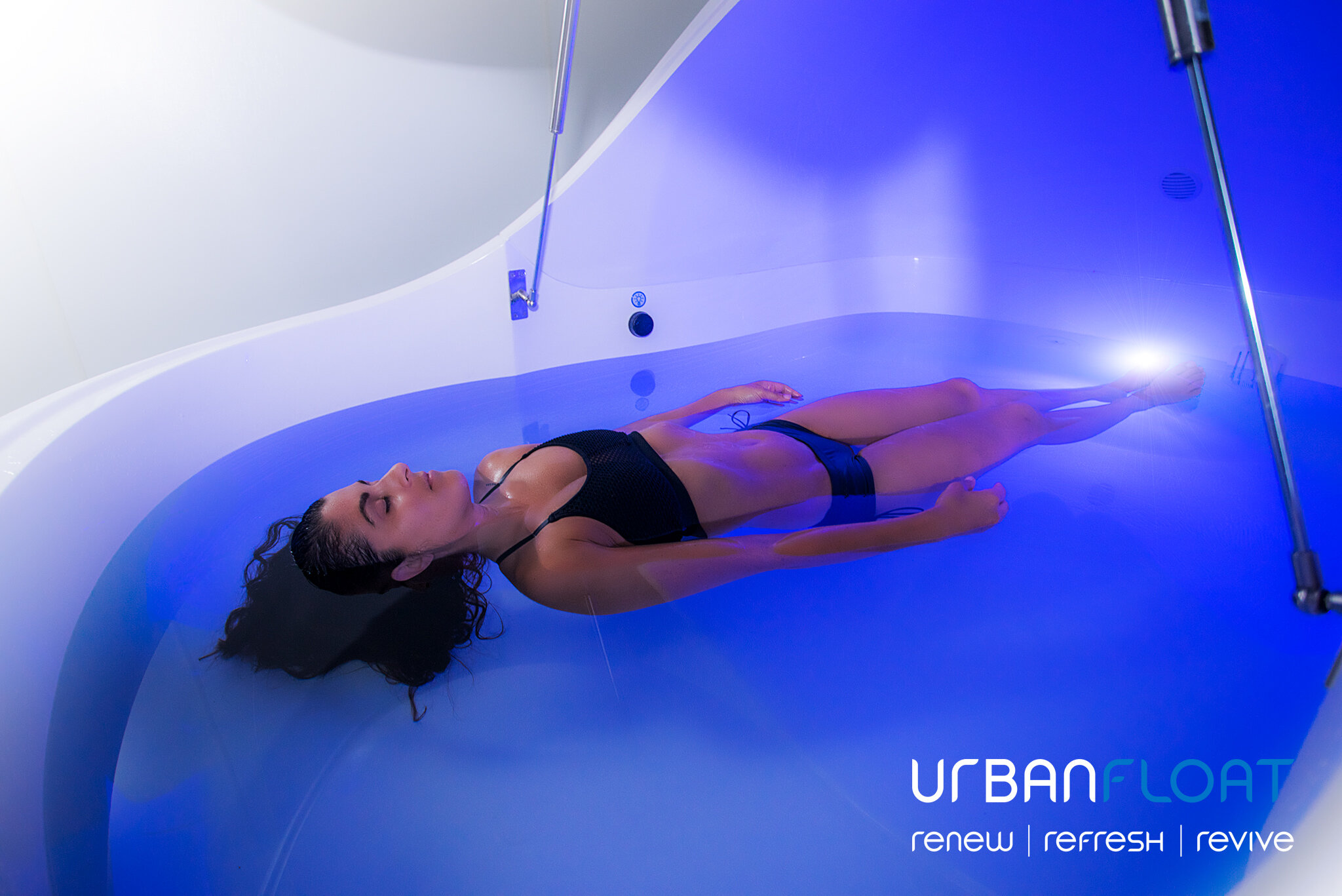
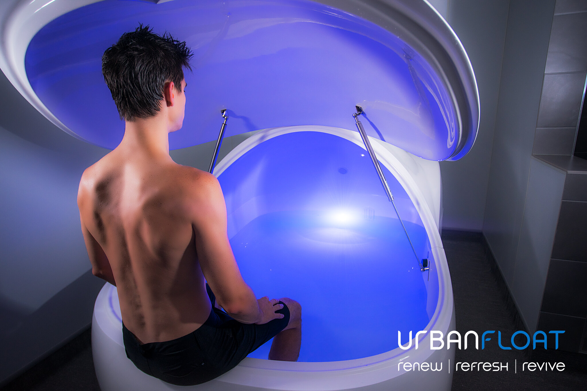
By the time 2018 came around, our assets had been heavily used and the brand image needed another shift, not just for ourselves but for our franchise centers. I took this as an opportunity to blend all these ideas from four years into one and create bold & beautiful sets with some local talent. The gallery below is exactly what the brand needed - showcasing floating in it’s natural element. Not overly contrasty - not “spa white” and most importantly it shows our service and our rooms in a clean, but true to life setting.
It’s important in any business to pay close attention to your brand and its message. Understanding what your customer wants and how to educate them before they even set foot into your business or on your website. Even if you don’t have someone on your staff that can do this - investing in this type of content is vital - don’t be cheap and don’t “borrow” or “download” content from the internet as a solution.
Thanks for reading!